Making Dave Powell Design

Branding - UX Approach - Website Build

Any designer worth their salt has to create a portfolio site, and that site must have a memorable brand. The image you see above is definitely Photoshopped, but I've always liked the way this promotional project turned out. I found an exposed brick wall in Little Five Points that was begging for a little something. But let me break down the brand itself and then show you how I went about creating this site before I get ahead of myself.

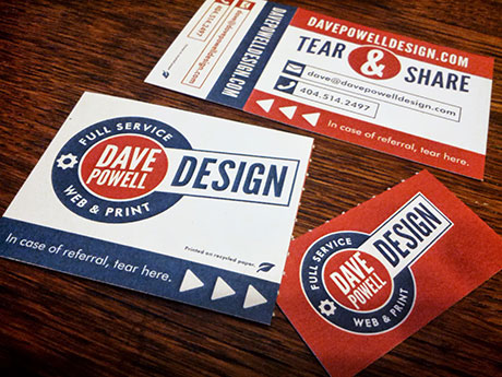
Early on I created my business card, the "Tear & Share" concept has been a big hit. Any chance to make a unique impression on a person should never be passed up. Since this photo was taken I've re-focused my efforts away from print work and into UX, hence the slight difference within the logo.

The "full service" tagline came about when I ventured out on my own after more than 8 years in a corporate environment. I freelanced and made it my business to provide anything a client needed to make their business a success. I paired the full service line with a look similar to a 40's style mechanics garage and, tada! I've got a brand that not only fits me, but gives my clients (or prospective employers) a good idea of my visual tastes.

I've since then applied this visual treatment to all of my billing, letterhead, and most recently a resume. Now that I'm back in the market for a full time position, a new website was calling. Previously I had a WordPress site, easy enough to use a template and slap images over it and some bare minimum CSS ... but that isn't really showing your skills online. Time to re-build from the ground up!

UX Approach & Website Build

Always start on paper. Less barriers, just your thoughts as fast as you can put them down. Map out the needs, get your arms around the content that must be vs. nice to have. Make sure that the choices you make are the best ones in the long run. It may look great here but if it will throw a wrench in the works when it's time to code ... best take a step back and re-think it.

Now elaborate on those sketches and notes with some more clearly defined wireframes. Ensure that everything works in a grid, start creating layouts to scale, and un-earth any obstacles now instead of later. The more savvy you are in the development space for a project, the more efficiently you can craft a design that won't have developers pulling their hair out next week. Everybody wins!

Last step (for this build) is to make some high res comps. Nail the visual look, get colors that you can sample for hex values, re-confirm the flow in a responsive scenario. Since I wrote this site myself using a Bootstrap framework and Sass, an interactive prototype wasn't called for. But if handing this off to a developer, you better believe that would have been next on my list! I hope that sheds a little light into my UX approach when designing this site and my overall branding solution.

Want even more detail?

Grab a PDF of the wireframes!

or

404-514-2497